Nest & Nook
Nest & Nook is a home decor brand that believes your home should feel like a warm hug- inviting, cozy, and uniquely yours.
The brief was simple: craft a visual identity that feels timeless and effortless, while instantly creating a sense of comfort and belonging.
Nest & Nook
Home décor
Brand identity
Logo system
Colour palette
Typography
Imagery direction
Campaign visuals
Challenge
Nest & Nook needed a cohesive identity that communicates warmth, everyday elegance, and approachability. The tricky part was balancing a classic, lasting look with a modern, friendly voice so the brand could feel luxe without being intimidating.
Objective
Build a visual system that evokes comfort and calm, one that makes people picture themselves curling up at home. The identity had to work across social, a simple e-commerce site and in public spaces — scalable, practical, and cozy.


Process
Research & positioning: I started by mapping competitors and customer vibes in the home-decor space, then distilled what felt missing: brands that were either too cold and minimalist, or too cluttered. Nest & Nook needed the middle ground, warm restraint.
Visual direction: From there I explored organic shapes, soft letterforms, and a grounded colour story. Photo direction leaned into tactile moments: folded linen, a steaming mug, sunlit corners.
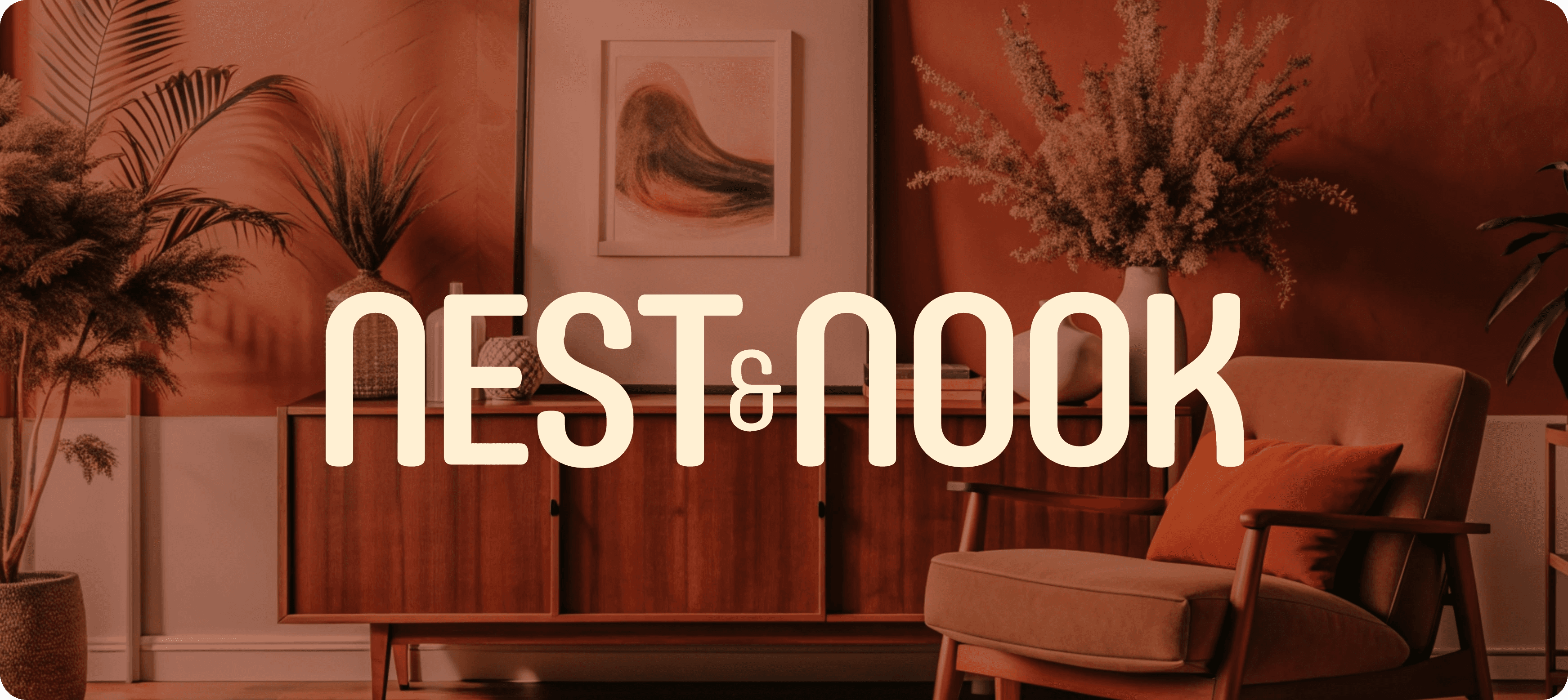
Logo & mark: The logo pairs rounded letterforms with subtle curves to feel soft and human. The ampersand was redesigned as an interwoven element to symbolize connection — home as a place of belonging.
Outdoor campaign visuals: The campaign was designed for bus stops, billboards, and urban placements. Large, bold typography paired with atmospheric imagery ensures high visibility, while short, emotive taglines invite people to picture the comfort of Nest & Nook in their own spaces..
Visual Design & Style Guide: We developed a cohesive visual language—color, type, iconography—and a style guide for consistency across all campaign materials (outdoor, social, and digital).

Colour palette
Warm Linen — soft, calming base tone
Rustic Brick — grounding warmth that adds richness
Midnight Haven — a deep contrast tone for emphasis
These tones create a feeling of serenity while standing out in outdoor formats.
Typography
A modern serif for headlines to bring personality and warmth, paired with a clean sans serif for supporting text. This pairing gives the campaign both elegance and legibility at scale.


Conclusion
Nest & Nook now enjoys a visual identity that feels like a warm welcome, memorable, cozy, and adaptable. Whether seen on a city billboard or Instagram feed, the brand invites people to experience the comfort of home.